Spread the Word

Site Feed


Powered by FeedBlitz

Subscribe with ...

  • Add this blog to my Technorati Favorites!
  • Subscribe in Bloglines
  • Subscribe in NewsGator Online
  • Subscribe in Rojo
  • Add Random 

Bytes (WebLens Blog) to Newsburst from CNET News.com
  • Add to Google
  • Add to My AOL
  • Subscribe in FeedLounge
  • Add to netvibes

Translate This Post

Burn a Feed

Ping the World

Showing posts with label Web Design. Show all posts

Thursday, June 02, 2011

Announcing .. The WebLens Daily!

Lots of new developments at WebLens right now. We've been twittering up a storm, so we've just launched The WebLens Daily, a handy digest of relevant Twitter posts delivered to your desktop each and every day. Subscribe or follow us on Twitter to stay up to date with tweets relating to Internet and net search news, as well as web design, social media, and SEO and online marketing trends. Updated daily with fresh and timely content, and links to useful resources and interesting and entertaining sites. Drop by today and let us know what you think.

NEW!! The WebLens Toolbar

Announcing the brand new WebLens Toolbar. Keep all your favourite resources right at your fingertips, no matter what site you are viewing. Compatible with IE, Firefox, and Chrome, the WebLens Toolbar can be downloaded from any page on the site. It comes loaded with all the WebLens menu contents you've come to know and love, plus loads of extra goodies, like quick links to Facebook, Twitter, local weather, Amazon deals, Groupon, Flixster movies, Travelocity, TripAdvisor, Youtube, and more!

The WebLens Toolbar also includes a radio player and one particularly useful resource — Similar Sites, which displays thumbnails of sites similar to the one you are on. Best of all, the toolbar is fully customizable, with a marketplace of thousands more apps to choose among.

Get it today at our download page.

Tuesday, April 01, 2008

Fractallicious Reborn

Well, I finally did it! I'm out of the stock sites. As some of you know, I have been experimenting with selling my artwork online through half a dozen stock photography and microstock sites for a couple of years. While they were generating income, the experience has never been ideal. Uploading was time-consuming, especially with so many sites. It was frustrating to have certain sites reject an image for utterly arbitrary reasons, while others accepted the very same image. And I certainly didn't enjoy giving away 50% of my income to these companies for the privilege of hosting my art. I felt none did a good job of marketing or promoting my work.

I had already had my own site, Fractallicious, up and running for about a year, functioning primarily as a signpost to direct interested people to the various stock sites and other places, such as CafePress, where they could buy my fractal art. Fractallicious was successful in that regard, but once potential customers landed on one of the stock sites I had sent them to, I became a tiny fish in a huge ocean of competitors. Income trickled in in dribs and drabs.

So I set out to be my own stock site. Turns out, I sadly under-estimated the challenge involved in turning a static web site into a full-blown ecommerce application. It's been a long tough slog, with numerous technical difficulties, but we're finally there! The company we chose, Volusion.com, provides a turnkey ecommerce platform, allowing you to create an online store with a powerful database back-end, shopping cart, and merchant account services. The Volusion technology is robust, complex, and highly configurable. Because of this very complexity, it's also far from intuitive and comes with a steep learning curve. The company scores an A+ for the superb quality of their 24/7 technical support.

So, starting this week, I have eliminated the middleman! (And, no, this is NOT an April Fool's joke.) I'm partnering with my sister on this endeavour, and we're not only selling gorgeous (if I say so myself) high-quality image downloads, but also certain images printed on a variety of merchandise, CafePress-style. My rainbow designs have been very popular with the gay and lesbian community, and we're starting with three of them printed on 1" buttons, and attractively packaged as a three-pack for gift giving.

Drop by Fractallicious.com, and have a look. If you like what you see, please feel free to spread the word!

Monday, April 23, 2007

3 Column Widgets Compliant Blogger Template!

Success! In a previous post, I noted that the New Blogger supports my three-column template in "classic view," but rejects it in "widgets view." I am happy to report that I have solved the problem. After much experimentation, I now have a working three column version that you can open and edit in either HTML view or in "widgets" view.

It was much more than just a bit of badly formed XML. The code that the new Blogger uses for its "widgets view" is a radical departure from the XML that the old Blogger used. New Blogger uses variables, inserts several strange new tags into your code, and stores information differently. All of this is in support of a new user-friendly interface that enables you to add objects (Blogger calls them widgets) and change your blog's template without having to know a speck of code. The code structure underlying this, however, is finicky and much less tolerant of syntax errors than Blogger's previous incarnation of XML.

To get the 3-column template working properly in widgets mode, I basically had to rebuild it from scratch, from Douglas Bowman's new widgets-friendly 2-column Minima design.

Two Template Choices

As a result of this, there are now two versions of the three-column template.
  • Classic: If you are using the Old Blogger (or if you are on New Blogger but don't anticipate needing to significantly modify the template), use the original 3-column version. Note that you cannot open this version in Widgets view. This means you cannot add newsreels, video, a label list, or any of Blogger's other new page elements. You can modify the template, but you will need some familiarity with HTML.
  • Widgets: If you are on New Blogger and want the ability to easily customize the fonts, colours, or layout of the template's elements, and prefer to use a point-and-click interface, use the new Widgets version. You can make look and feel changes through an interactive point-and-click interface or by editing the HTML. This version also supports new Blogger features such as newsreels and video, and lets you take full advantage of Blogger's new support for category labels.

Changing Template Fonts & Colours

To modify the Widget template's current fonts and/or colours, open your Blogger dashboard, then click Layout / Template > Fonts & Colors. Choose the element you wish to modify from the list at left, then select the new font and/or colour you want for that element. Click Save Changes and view your blog.

Modifying Page Elements

I have designed the new widgets version to look as similar to the original as possible. It contains placeholders for your profile, blog archive, labels, popular posts, blogroll, and more. However, because of the way that new Blogger now handles information, some page elements will not appear in preview mode until you enter details for them, and you won't see the details in your HTML code at all.

To modify an existing element, click Template > Page Elements. Select the element you wish to modify, then click its Edit link and add the necessary details. You can change its title and/or default configuration any way you like. Click Save Changes when you're done.

Removing Page Elements

To remove an element, click its Edit link, then click Remove Page Element.

Adding New Page Elements

You can add new elements to either the left or right sidebar. To add an element to a sidebar, choose the sidebar you want to modify, then click its Add a Page Element option. You'll see a list of fourteen types of elements. Choose the one you want, then click Add to Blog. Blogger will prompt you to complete the title and/or other details. You can move elements around or change their stack order by dragging them.

Be aware that certain types of elements, such as link lists or HTML/Javascripts, can be added multiple times. Others, such as your Blog Archive, will generate an XML error if added more than once.

If you wish to change the widths, margins, padding, or border styles of the three columns, you will need to edit the HTML.

I hope you find these templates useful. Remember, before you make major changes, be sure to back up your current template.

Thursday, April 19, 2007

3-Column Template Fix for New Blogger

Update: Widgets version now available! See this post for details.

With apologies for the long wait, I have finally gotten around to investigating why some people were having trouble bringing my 3-column template into the New Blogger's HTML editor. One of the reasons holding me back was my own reluctance to embrace anything new from Blogger, but I finally took the plunge this morning, and so far so good. It's also the first time I have posted in a couple of months due to a heavy workload. Anyway, on to the topic of this post ...

The good news is that there is nothing wrong with the original 3-column Blogger template, found here. The problem was with my instructions (sorry), which were perhaps not specific enough. Some people evidently saved the HTML version of the template displayed when you click the link. That only gives you part of the code (which works fine if you're using Firefox, by the way). If you use IE, however, you need to open the template, view the source code, and then save or copy and paste into your template editor. IE does not display all the code, including the stylesheet and the all-important doctype declaration at the top.

Please be aware that this three-column layout will not work as is with the new Blogger's layout mode which uses something called "widgets." It works fine when pasted into their classic template, but it's generating XML errors in "widget" mode. I am working on a widgets modification, and it should be forthcoming shortly.

Hope this clarifies things, and again, apologies for the long delay in finally getting this information to you. Happy blogging!

Friday, November 24, 2006

Transparent PNG Generator

A while back, I blogged about CSS transparency techniques, describing two methods for incorporating transparent elements into your design. You can also introduce transparency by using PNG format images. Unlike GIF images, which are either "on" or "off" in terms of opacity, PNG images support full alpha transparency. This means each pixel can display a subtle range of tones from 0 to 255.

There are many ways to create transparent PNG images. If all you need is a plain transparent block to use as a background, check out Stian Grytøyr's handy transparent PNG generator. This useful tool allows you to select a colour by clicking on a color wheel. The tool creates a set of samples ranging from 0% to 100% transparency, in three versions of the selected colour (web-safe, "web-smart," and unsafe).

Lighten or darken the sample by clicking on the saturation/lightness patch to the right of the colour wheel. When you have the desired shade, click through on one of the percentage samples to see it used with some demo text against a busy background. From here, you can adjust the image dimensions, transparency, and colour. Right-click on the final rendered sample to save the image to your hard drive.

Note: The PNG graphical format enjoys strong support among compliant browsers such as Firefox, Opera, Safari and IE version 7. If, however, you view Grytøyr's page in IE 6 or lower, you will not see the transparency effect, as earlier versions of IE do not support full alpha transparency. For details, and a workaround, see A List Apart's article, Cross-Browser Variable Opacity with PNG: A Real Solution.

Monday, September 11, 2006

Horizontal Suckerfish and More CSS Menu Resources

I blogged back in June about my efforts to enhance WebLens with CSS-based dropdown menus that were standards compliant and which work across all browsers, including the persnickety Internet Explorer. In a post on creating dropdowns that work in IE, I summarized the three approaches I had found. I chose the very popular Suckerfish solution for WebLens, and it has been a great success.

In building the menu system recently for a site about a popular Canadian television personality, I wanted to modify the Suckerfish code to display the sub-menus horizontally in a row instead of stacked one below another as seen on WebLens. Google queries on this didn't lead to much, except a few help requests posted to webmaster forums, so I puzzled it out myself.

You can see the result of this tweak at the site mentioned above, and the code is available here for your use, should you want to play with it. I'm pretty happy with it; the only failing has been my inability to figure out how to align the sub-menus with the left edge of the top menu containing DIV, instead of the individual list items. No amount of fiddling around with positioning seemed to solve this.

In trying to troubleshoot this challenge, I never did find a fix, but I came across more helpful CSS menu resources, including some great articles:

Had I seen the ListApart Hybrid CSS Dropdowns article earlier, I might have chosen that technique instead of struggling to modify the Suckerfish code myself. Oh well. Live and learn :-)

I can't wrap this up without mention of a couple of CSS and/or DHTML menu generators (free and/or for fee) for those not inclined to hand code. Check these out:

Hope you find these resources useful. Enjoy!

Tuesday, August 15, 2006

Template Background Hacks and Generator Tools

Random Bytes has had a facelift. For those who have been here before, the new look may be a bit of a surprise. If you popped by yesterday afternoon, my apologies. This blog's look and feel was evolving minute by minute, as I experimented with colours and backgrounds.

I think I've got something I like now, though, so it shouldn't change too much more. I felt it was time for a fresh look, especially since the old look and feel has been propagated through the blogosphere with the growing popularity of my three-column template.

For the new design, I wanted to focus on simplicity and readability. The first priority was eliminating the background mouse graphic, which had cluttered up the design and drawn some negative feedback for slowing page loads.

Creating Background Colours and Patterns

In choosing a color palette, I opted for a monochrome colour scheme, staying with green to tie into WebLens (albeit subtlly). I wanted the blog contents to display against a background colour or pattern, and found Rails2U's Background Image Maker indispensable. This useful tool allows you to generate any size background rectangles for tiling. You can specify desired color by dragging sliders or entering a hex code. The tool allows you to choose between stripes, dots, and gradients, and supports full PNG transparency.

There are also plenty of free online sources of background rectangles for tiling, such as the collection at GRSites. (If you use these, be careful of placing text directly against a busy background. Place a white or coloured background behind the text first, as I have done here.)

Adding Backgrounds to Your Blog

You can use the images produced by the tools mentioned above as your blog's main background as I have done here, or place them behind various CSS elements, as you seen in the sidebars and post titles of this blog. For this re-design, I finally settled on a striped green background for the main page and a subtle green gradient to use for emphasis and visual interest.

To add a background pattern to your blog

  1. Open your template and locate the CSS for the body tag.
  2. Between the opening { and closing } parentheses, add a background declaration pointing to where the background image is hosted, as in
    background: url("http://your-domain-and-filename.png") repeat;
    (Note that you will need to host these images elsewhere, as you can't upload them to Blogger.)

The repeat attribute controls tiling, telling Blogger to replicate the graphic both horizontally and vertically, as I have done in the main background here. To repeat only horizontally, as in this blog's post headings, change the repeat attribute to repeat-x. (For vertical repeats, it would be repeat-y.)

To add background tiles to post headings

  1. Open your template and locate your blog's CSS post declaration.
  2. Add the above code, but with repeat-x. Note: you may need to move the opening post div tag above the date header, to get the background behind everything. Depends on the effect you want.

To add background tiles to sidebar elements

In this blog, I could have placed a background gradient or texture behind the entire sidebar, but I wanted to use them to emphasize certain sidebar contents. To do this:

  1. Create a style specifying the desired formatting, such as
    .BlueGradient { background:url("http://your-
    domain-and-filename.png
    ") repeat-x; padding-top:2px;}
  2. In the HTML, locate each set of sidebar elements you wish to emphasize, and enclose each within your new div, as in this example:
    <div class="BlueGradient ">
    <h2>Archives</h2>
    <ul class="archive-list">
    <BloggerArchives>
    <li>
    <a href="<$BlogArchiveURL$>">
    <$BlogArchiveName$>
    </a></li>
    <BloggerArchives>
    </ul>

    </div>
  3. Save your changes and view your blog. You may need to adjust margins or padding to get the effect you desire.

For more on adding backgrounds to your blog, see this earlier post. Hope this information helps, and let me know what you think of the new design.

Tuesday, August 08, 2006

The Web's Most Useful Site?

I may have just stumbled across the Internet's most useful site — for webmasters at least. The Scrutinizer is a single page from which you can run dozens of different tests on the content of any page in your site. Available tests run the gamut from HTML and CSS validation and link popularity and rank checks to pings and traceroutes, plagiarism checks, site speed tests, and more.

Just enter your URL, select the test(s) you want, and click Go. Great resource.

Friday, July 21, 2006

Church Sites That Inspire

I'm not religious, but I love this web site! Stumbling around the Web late last night, I came across ChurchBeauty, and couldn't pull myself away. No, it's not about church architecture — though that would be interesting too — it's a showcase for quality church web sites, similar to the many CSS design galleries on the Web.

The site author (who, unfortunately, doesn't identify himself) has collected high-quality church sites and organized them into several categories, including clean, simple, colour scheme, photography, CSS, classic, video, and organic (not quite sure what that means). Though he focuses on visual design, he also provides categories for writing and usability. This is the first design gallery I have come across that acknowledges the importance of content.

He invites visitors to recommend sites for inclusion, and you can click through and rate the linked sites. A fun site to poke around, especially if you're seeking inspiration — divine or otherwise.

Tuesday, July 11, 2006

Preventing Disappearing Columns and Sidebars

Update: for more on troubleshooting Internet Explorer quirks and bugs, see this post.

Over the last few months, many people have downloaded the three-column templates provided here. These templates use a fluid layout, which means that content scales to accommodate the viewer's font size and/or browser window rather than being locked down at a fixed width. The templates were tested in a wide range of browsers before I put them online. Overall, their performance is solid and feedback has been great. A few people, however, have reported strange behavior in older versions of Internet Explorer. In certain situations, the right-hand column or sidebar may mysteriously vanish or jump around unpredictably.

This well known IE problem actually afflicts many three-column designs that use a fluid or liquid layout. It appears when you enlarge screen fonts or reduce browser window dimensions. And, no, Firefox is not immune.

However, IE versions 6 and earlier are responsible for much of this behaviour. It is due to IE's faulty implementation of the CSS box model, which describes the boundaries of HTML/CSS elements. According to the W3C specification, the width and height of a CSS element is based upon the raw dimensions of the element itself, before the addition of margins, padding, and borders. IE, however, uses a different box model, in which padding and borders are included in calculated base width. When fonts are enlarged beyond the width of a container, IE also improperly widens the container. These differences between the two approaches are responsible for many layout inconsistencies among browsers, including the wrapping third column problem seen in liquid layouts.

Fortunately, there are some simple fixes you can try. And, for the really stoic, all kinds of box model hacks that you can use to achieve virtually identical performance from IE and standards-compliant browsers.

Troubleshooting Tips and Fixes

If all you want to do is prevent a third column from wrapping and absolute consistency across browsers isn't huge issue for you, the troubleshooting strategies below may solve the problem:

  • Check for images, form input elements, and web site URLs that exceed column widths and may force wrapping
  • Reduce the width of form input elements until columns cease wrapping
  • Reduce image sizes until layouts behave themself
  • Shorten the alt text of web badges — long strings can force wrapping if the badge doesn't display for some reason
  • Try reducing the width, margins, borders, or padding of one or more columns
  • Reduce the font size slightly.
  • Increase the overall width of the container div by a few pixels or percentage points
  • Make sure the cumulative width of all columns, plus their margins, borders, and padding does not exceed 100% of the width of their container div
  • Remember that borders add width — one pixel can force unwanted wrapping!
Often, a combination of these measures will seem to eliminate the problem. Don't assume, however, because your layout looks fine in Firefox or your version of IE, that no problem exists. Test in as many browsers as you can, especially older versions of IE. Often, the problem appears when window dimensions are reduced, so test at different window sizes. The problem can also occur when screen fonts are enlarged, so test at different font sizes too (click View / Text Size, and select increasingly larger font sizes, or press control while scrolling your mouse wheel). For the ultimate test, view at large font size in an 800 x 600 size window (type javascript:window.resizeTo(800,600) into your browser address field to simulate this width).

Box Model Hacks for Forced Cross-Browser Consistency

If you wish to trick Internet Explorer into acting like a standards-compliant browser and you are comfortable with CSS, consider using IE conditional comments to provide an alternate style for IE or try the box model hacks linked below. There are several versions of the box model hack, all of which involve "tricking" IE into rendering the box to the same dimensions used by compliant browsers. Be warned, however, that most of these are not for the faint of heart:

Hope these tips help, and if other strategies have worked for you, please drop a comment below.

Thursday, June 29, 2006

Three-Column Template Generator!

I have blogged a couple of times recently about ways to create 3-column templates. These posts have provided free templates for you to grab and customize, both for blogs and for regular web sites.

If you don't care for my designs, or if customizing them is beyond your comfort zone, you might want to try Firda Beka's Firdamatic tableless layout generator. This easy-to-use tool gives you a choice of two or three columns along with several customization options.

Best of all, you can use the code generated by Firdamatic for a regular web site, or click through to XML versions of the code for blogs. She has one for Blogger / Blogspot users and another for Moveable Type. A great resource. Thanks Firda.

(FYI: If you don't see two side-by-side columns on Firda's site, resize your window: she's got a vanishing float thing happening at certain window sizes.)

Thursday, June 08, 2006

Graph Your Site Code!

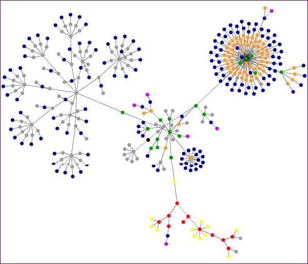
ProBlogger's Darren Rowse has a post this week about an entertaining little Java applet that graphs the HTML entities that comprise your web site. Websites as Graphs generates a swarm of colourful — and strangely mesmerizing — dots that coalesce into interesting patterns representing your site's structure.

Rowse used it to illustrate his post with several graphs that plot competing sites, including Google versus Yahoo and Engadget versus Gizmodo.

Already, a community is growing around this tool. Check out the graphs that people have posted at Flickr.

I was curious to see how it would treat WebLens. You see the result here. Give it a try for yourself. Just type any URL (web address) into the screen form and watch the fun begin. (Tip: scroll down the results screen for an explanation of the colors used.)

Monday, June 05, 2006

This Glossary's a True Knowledgebase

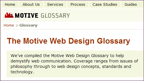
Ever need a quick tech definition? Motive Corp has put together a pretty impressive Web Design Glossary. The definitions they have amassed aren't extensive in quantity, but they certainly are in the depth of information provided for each term.

In fact, this handy resource borders more on knowledgebase than mere glossary, providing concise mini-tutorials and links to further reading on various web-related topics. It's not as comprehensive as a Wikipedia entry, but provides quick introductions to various Internet concepts for those in a hurry. Definitely worth a look.

For more Internet glossaries, scroll or jump to the bottom of WebLens Reference Tools page.

Thursday, June 01, 2006

CSS Menus: Create Dropdowns That Work in IE

Update: For horizontal Suckerfish, see this post.

WebLens has undergone yet another facelift. Having never been happy with the previous horizontal menu bar — accomplished with a kludgy Javascript that worked unpredictably — I set out a week ago to replace it with a CSS menu that uses semantically correct HTML. The process is worth sharing here.

The Challenge

When it comes to CSS drop-down and pop-out menus, there's good news and bad news. The good news is that it's absurdly easy to create elegant CSS-based drop-down menus that are standards compliant and cross-browser compatible. The resulting pages are cleaner and more compact. They load faster, are more search engine friendly, and pass W3C validation. The bad news, as usual, lies with Internet Explorer's refusal to play by the rules.

CSS drop-down and pop-out menus are built with nested unordered lists. The drop-down effect is enabled by the ability of standards-compliant browsers to apply the :hover pseudo-class to any element in an HTML document, including list items. Unfortunately, Internet Explorer — which still has a market share of over 90% — does not support :hover on anything but the <A> element. Achieving the drop-down or pop-out effect in IE requires extra measures to make the browser mimic the :hover behaviour.

Three Possible Solutions

I bookmarked dozens of sites in attempting to find a true cross-browser solution for CSS menus — one that works not only in standards-compliant browsers like Firefox, but also in IE, which still sets the standard, whether we like it or not. The techniques I found cluster, essentially, into variations on three fundamental approaches:

Suckerfish: CSS with Javascript Help for IE

One of the first solutions proposed was Patrick Griffiths and Dan Webb's Suckerfish Dropdowns. Elegant in its simplicity, Suckerfish involves using CSS to style a set of nested lists, with a short snippet of Javascript to attach mouseover and mouseout events for IE. Griffiths and Webb's original AListApart article describes the process in clear, straight-forward language and provides code samples you can clone and make your own. Numerous variations of Suckerfish have been proposed, and discussions of solutions to challenges encountered with this approach are ongoing. This is the method I ultimately chose for WebLens.

WhateverHover: CSS with DHTML Behaviors for IE

A similar but — to my mind — more technical approach involves using dynamic HTML behaviors to make Internet Explorer behave itself. This method uses CSS to style drop-down menus for browsers that understand the :hover pseudo-class, with Microsoft conditional comments containing a call to an external HTC file for IE. The technique is explained well by Claire Campbell and Peter Nederlof. Mark Wilton-Jones provides a version for vertical pop-outs.

Stu Nicholls' CSS/HTML Hybrid Solution

Finally, one of my favourite CSS sites provides a novel third approach. Stu Nicholls' CSS Play contains dozens of examples of innovative CSS implementations, including a huge collection of menus. One of these, the Ultimate CSS Only Dropdown Menu, uses CSS together with IE conditional comments and simple HTML tables to style dropdowns that work in both IE and compliant browsers. Nicholls' solution uses just CSS/HTML; no Javascript or IE behaviours.

Note: Nicholls' solution validates, as do the other approaches discussed here, if implemented correctly. WebLens passed the CSS validation easily after including the Suckerfish menu. The new CSS WebLens menu also passes HTML validation, but many of the pages fail because of the embedded ad code, which is not standards compliant.

Monday, May 15, 2006

Blogger Template Hacks: Changing Fonts

When I created this blog, I accepted the default font specified in Doug Bowman's Minima template design: an attractive serif typeface called Georgia. I thought it was time, however, for a minor facelift to tie in more closely with WebLens' look and feel. Fortunately, changing fonts is quick and easy with the CSS built into Blogger's templates. Here's how, for those new to this:

  1. Open your Blogger template and find the CSS for the Body tag.
  2. Between the opening { and closing } parentheses, add the following code:
    font-family: "Trebuchet MS", Tahoma, Arial, sans-serif;
  3. If there are other font declarations for the body tag, make sure they don't specify a different font. In the original Minima template, for example, the body style contains this code:
    font:x-small Georgia,serif;
    I removed the word Georgia and left the size specification as is. (If you wish, you could roll the two statements into one, for more compact code. It would look like this:
    font:x-small "Trebuchet MS", Tahoma, Arial, sans-serif;)
  4. To vary the font size, try changing the size declaration. xx-small will reduce the size; small or medium will increase it. These are relative font sizes, which means that they will scale based on the user's default settings. There are many other ways to specify font size, such as %, ems, and pixels, but we'll save this discussion for another time. (Be careful here: changing font size can lead to overflow problems.)
  5. Save your changes and re-publish your blog.

That's all there is to it. The steps described above will apply the specified typeface globally to your entire blog. If you wish to make the change selectively — to headings or sidebars only, for example — locate the CSS for the element you wish to style and insert the code there instead.

Some Font DOs and DON'Ts

The code snippet above illustrates the recommended way to specify a typeface for the Web. Suggesting alternates allows you to control which typefaces people's computers substitute if they don't have the first font specified among their system fonts.

Using a relative font sizing unit, like the keywords small and x-small shown above, is also recommended since this gives users control. Specifying absolute font sizes — in pixels, for example — deprives users of the ability to change font size, leaving your page not very useful for those with impaired vision or aging eyes.

Font Lingo

For those unfamiliar with typesetting terminology, the terms serif and sans serif derive from Latin, and refer to the presence or absence of the little "feet" you see on each character in a serif typeface such as Georgia or Times. A sans serif typeface lacks these, making for a cleaner look. Sans serif type is often recommended for onscreen viewing. (The embedded screenshot illustrates how this blog looked before this post. You can decide which you like best.)

Hope you found this post useful. If so, please support Random Bytes with a link from your blogroll. Sign up for our feed for more on this topic.

Friday, May 05, 2006

CSS Showcase Sites Multiply Like Bunnies

Big surge in traffic last week, thanks to a front page link here from CSS Drive. (Seems someone there found my article about CSS transparency noteworthy.) CSS Drive is one of the Net's many CSS design showcase sites. These sites are worth a visit whether you're seeking inspiration, trying to figure out someone's code, or just endeavouring to keep up with trends in CSS and web design.

These design galleries exist in the zillions — well, OK, maybe I'm exaggerating a bit, but several are worthy of your bookmark list. The best-known, of course, and the one that started the trend is Dave Shea's CSS Zen Garden. Others worth a look include CSS Beauty, Unmatched Style, CSS Vault, and StyleGala.

There are new CSS showcase sites almost every day. In fact, the rate at which these sites are proliferating leaves no doubt that CSS has taken the web by storm. We'll keep you posted on noteworthy new additions.

Tuesday, April 18, 2006

Two Techniques for CSS Transparency

One of the trickiest things to control, in a CSS-driven design, is the transparency of the interaction between foreground and background content. Browser inconsistency — most notably IE's stubborn refusal to comply with standards — only adds to the challenge. I was struggling with this until I ran across Stu Nicholls' CSS Play web site. This site abounds with powerhouse CSS demos, including some great cascading menu effects and the best examples I have seen of the differing transparency approaches possible with CSS.

Background

(For the non-techies in the crowd, the term transparency — also called opacity — refers to how much of the background is visible through the foreground on a web page. Until the emergence of CSS, web designers had limited control over transparency. We could use transparent GIF images, which offer all or nothing in terms of transparency (i.e. the background is either 100% transparent or 100% opaque), or we could resort to the PNG graphic format, which offers true alpha transparency but limited browser support. (For details, and for some useful IE PNG hacks, see A List Apart's posting about the PNG format). The only other solution has been a kludgy workaround involving placing a lightened duplicate of the background image in the foreground. Nicholls illustrates this approach as "method 3" on his page of opacity demos.

Clever CSS3 Transparency Hack to the Rescue

One of the solutions that Nicholls demonstrates ("method 1') utilizes a clever cross-browser code hack that marries IE and Mozilla proprietary code with an opacity property that is part of the CSS3 working draft. It is an elegant solution that affords complete control over degree of transparency. This technique essentially involves creating and styling two DIVs — one to contain the background and a second to hold the foreground text (if they were in the same DIV, the foreground text would be transparent too). The HTML looks something like this:
<div id="sidebarLeft"> </div> <div id="leftwords">
<H3>Left Column</H3>
...
</div>

Note that the "sidebarLeft" DIV is empty. Its sole job is to provide a hook to hang a style on, in this case one called "sidebarLeft." This style is formatted as per normal, in terms of padding, margins, width, height, etc. but, then — and here's where the magic happens — for a transparent effect, the CSS snippet below is added.

#sidebarLeft{filter: alpha(opacity=75);
filter: progid:DXImageTransform.Microsoft.Alpha(opacity=75);
-moz-opacity: 0.75; opacity:0.75;
}

Another style (#leftwords) formats the text block placed against the background. To illustrate how this hack works, I have prepared a new version of the three-column template discussed here earlier with this opacity effect for the left sidebar. Feel free to download the template, called White True Opacity, and experiment with level of transparency. To do so, open the template and change the values highlighted in orange above to any number between 1 and 100. Change the values highlighted in blue to a number between 0 and 1. Lower numbers will make the item more transparent; higher numbers, less so. Save and reload the page.

Shown as "method 1" on Nicholls' site, this transparency effect is cool, but be aware that it uses techniques that are not standards compliant and which lack wide browser support.

Low-Tech Transparency for the Rest of Us

Fortunately, there is another technique that designers have long resorted to, and which doesn't break any browsers. It's a low-tech workaround that's quick and easy to implement. It, too, is a "hack" — using a PhotoShop trick to create a 50x50 tile that fakes the appearance of transparency. Firda Beka shows how it works here, and offers a nice selection of ready-made 50x50 background tiles you can grab and save. To use these in a stylesheet, just add this declaration to the style for the element you wish to format:

background:url(filename.gif);

where filename.gif is the 50x50 semi-transparent GIF you just made or downloaded. Save your work and re-load the page. Try it with several of Firda's 50x50 sample tiles. Whether the resulting effect is gorgeous or hideous will depend largely upon other foreground and background colours in your design. You can experiment with this technique using this template, called White Fake Opacity, if you like. Just replace the GIF that I used with a colour of your choosing.

Please feel free to use either or both of the designs I have posted here. To put your own stamp on them, just save them to your desktop, open, and modify the styles as needed, and substitute your copy for the placeholders. If you're hand-editing the code, be careful not to delete any of the DIVs, or you'll break the layout. And if you're finding these posts useful, please support Random Bytes with a link from your blogroll.

Friday, March 24, 2006

Another Three-Column Template

Some time back, I wrote about how to modify the default Blogger template for a three-column layout, with a link to a completed template for those not inclined toward hand-coding. The template I provided works fine in Blogger but isn't appropriate for conventional web sites because of the embedded XML.

I've noticed a lot of people searching on this topic in my stats, so here's a 3-column template for regular web sites. This template creates a barebones tableless three-column layout using CSS. The design is minimal, with dummy text to illustrate where your content will appear.

To put your own stamp on this design, just save it to your desktop, open it, modify the styles as needed, and substitute your copy for the placeholders. If you're hand-editing the code, be careful not to delete any of the DIVs, or you'll break the layout.

Hope this works for you. Feedback welcome. And if you're finding these posts useful, please support Random Bytes with a link. Sign up for our feed to ensure you don't miss future articles.

Saturday, March 18, 2006

Generate Everything from Graffiti to Web Buttons!


Regular readers of this blog will know that I'm a great fan of gadgets. I stumbled across another one a few days ago. The Glassy Button Generator will be of interest to web designers who are in a hurry and those who are aesthetically challenged. Just plug in a few variables, such as foreground and background colours, button dimensions, typeface, font size, etc., and this useful tool will crank out a round-edged glassy looking button for you to grab and save. It even creates rollovers.

I got this great find at The Generator Blog, another bookmark topper. This blog provides daily links to sites that generate all kinds of things from utter nonsense like the Silly Walk Generator, the Bush Speech Generator, and the Graffiti Generator I used to create the illustration for this post. These silly examples are utter time-wasters, but the Generator Blog links to dozens of useful resources too, like the Random Texture Generator and DiscoverySchool's Worksheet Generator.

The Generator Blog is a guaranteed time-gobbler. Check it out. And if you like these suggestions, please consider blogrolling Random Bytes.