Spread the Word

Site Feed


Powered by FeedBlitz

Subscribe with ...

  • Add this blog to my Technorati Favorites!
  • Subscribe in Bloglines
  • Subscribe in NewsGator Online
  • Subscribe in Rojo
  • Add Random 

Bytes (WebLens Blog) to Newsburst from CNET News.com
  • Add to Google
  • Add to My AOL
  • Subscribe in FeedLounge
  • Add to netvibes

Translate This Post

Burn a Feed

Ping the World

Friday, December 21, 2007

Test Your Vocabulary and Help Others Too

Came across a site a couple of days ago that, as a writer and avid Scrabbler, I couldn't resist. FreeRice lets you test your vocab skills and donate food to the hungry at the same time. Each word you get right is worth 20 grains of rice.

You gradually work your way up the levels, with the top score around 50. I hovered between 44 and 47 most of the time, and quit when I hit 48.

Can't believe how many words I've never heard of! Give it a try. Great fun.

Tuesday, July 03, 2007

The World's Chocolate Shops at Your Fingertips

Here's one for chocophiles everywhere. Get your daily fix of the sweet treat with Chocomap. This new Canadian web site, sponsored by Ecole Chocolat, uses the Google Maps API to find chocolate shops throughout the world. Using the standard Google Maps interface, you can search geographically then zoom in on a location. Read brief descriptions of chocolate destinations or post your own review. There's lots of other useful information too, including recipes, chocolate e-cards, interviews with top chocolatiers, tips on cooking with chocolate, and background information about the origin and cultivation of the plant that gives us this wonderful food.


Already, the site has more than 1,000 listings in over thirty countries. Definitely one for my favourites list.

Thursday, June 28, 2007

New Corbis Microstock Debuts

The beta version of SnapVillage — Corbis' long-awaited foray into the microstock arena — debuted a few days ago. I've done quite well online with some of the other microstock sites, so I was curious about how the traditional stock photography giant might approach the business of microstock. They had, after all, been slow to acknowledge the seriousness of the mounting competition coming from this quarter.

So far, I'm colossally unimpressed. I uploaded half a dozen images over a week ago, and as of this writing they still aren't processed. No acknowledgment at all.

Worse, the site times out quickly after the upload completes, so that if you do not immediately enter descriptions and keywords (that's right, the site doesn't support embedded IPTC information), you're bounced out, and you have to RE-LOAD everything all over again.

I was not impressed with the lack of support for IPTC data, which is pretty standard in the industry, as is the ability to upload via FTP. The site is still in beta, so one can only hope these features will be coming shortly. If they don't, SnapVillage will fail to attract professional photographers who have come to rely on such functionality at other microstock sites.

The quality of the existing images is poor, but then — in fairness — I guess Corbis faces a bit of a branding dilemma. They need to somehow differentiate this site from their costly "high-end" site. Unfortunately for them, some of the other microstocks have really raised the bar. Sites like Shutterstock, iStockPhoto, and DreamsTime feature excellent photographers and many professional quality images.

Corbis is late off the mark, and disdain virtually oozes from this site. It's evident in the name they chose — snapvillage — the word "snap" more than a little denigrating in its suggestion of casual snapshots rather than serious photography. It's almost as if they're targetting the Flickr amateur shutterbug crowd. Indeed, some of the images look like they came straight from the worst of Flickr.

All in all a failing score. One would expect more from a company backed by the Corbis brand and bankrolled by Bill Gates.

Friday, May 18, 2007

Google Overhauls Search Results Display

Got an email yesterday from a friend, with a link to an article about recent changes over at Google. Seems the search giant has yet again tweaked its search functionality. Such news always alarms me, as I teach Internet search and this usually means extra work. This time, though, the change is a small one.

According to CBC News, Google is combining its multiple search offerings (web, images, blogs, etc.) into a single "universal search". The change is only evident at Google.com (not the various international flavours of Google) and pretty superficial, from the user's perspective anyway. A few sample images and news search results — if there are any — have been rolled into the web search results list. Google also now offers the ability to narrow by related search.

The various search types (which were displayed immediately above the search field) are now at the top left of your screen. Additional search types are available through a dropdown instead of a link to a separate page and they are reduced in number.

Compare for yourself. Here's Google.com and here's the Canadian variant.

I can't quite see the point of this. But oh well. It's not earth-shattering.

Monday, May 14, 2007

Monetize Your Blog with Job Listings

SimplyHired.com's Job-a-Matic service allows any blog or web site owner to monetize a site with paid job listings. Target by industry and set your own pricing for listings you attract, and the company shares revenues with you 50/50. If your listings are on the skimpy side, Job-a-Matic "backfills" with relevant postings from SimplyHired.com's five million strong database of jobs. Click-throughs are rewarded with a 30/70% revenue split. You can target jobs by keyword or geographically, or both. (One down side — the service is currently limited to the U.S. only.)

Job-a-Matic generates a customizable listings page and lets you create widgets and ads that you can paste into your blog or site, as I have done at left below. The backfilled listings served by Job-a-Matic are attractive and easy to read, with some useful enhancements such as the ability to quickly and easily access geographically relevant salary information. Any listings you attract are added to the database, and promoted through SimplyHired.com's extensive network, which includes MySpace and LinkedIn.

The service debuted in February of this year, and already over 600 blogs have signed on. SimplyHired claims to be the world's largest job search engine and was lauded as one of the 50 Coolest Web Sites by Time magazine.

Tuesday, May 08, 2007

New Blogger Layout Conversion No Picnic

Whew! After hours of frustration, I have succeeded in moving this blog's template over into New Blogger. I did my best to maintain the same look and feel, but there are subtle differences. (You can see the old template by clicking on the thumbnail at left.)

And what a learning curve it's been. Hopefully, the results will prove worth it. One of the major benefits of New Blogger (and certainly my primary motivation in upgrading to widgets view) is the new labels/categories feature, evidence of which you can see at right below. Those who have been with me for a while will be familiar with the various not-so-successful code hacks and workarounds I have employed over the years in an effort to give this blog that all-important missing functionality.

I posted recently on the changes needed to get the 3-column Minima template that I give away here working properly in New Blogger layout view. That was a piece of cake compared to this blog's template, because of all the customization I had done. New Blogger didn't like my classic template at all, and the easiest approach to feeding New Blogger widget view something it could digest proved to be to rebuild it from scratch. I started with the 3-column Minima template, but you can only get so far dragging widgets around the screen. To get the functionality and look and feel I wanted, I had to delve into New Blogger's XHTML code, which is a whole lot more obtuse and less forgiving than Old Blogger's code. (Tip: all tags must be closed, even IMG tags, or they will generate error messages.)

More Internet Explorer Grief

Lots of challenges followed, including the usual crazy-making peek-a-boo float and IE box model problems. I employed an inelegant code hack (child selectors) to solve the latter problem and get the template performing roughly the same in both Firefox and IE. The peek-a-boo float problem was solved by adding {position: relative} to the div in question. There are still infuriating inconsistencies though, which I am at a loss to explain: the left padding of some of the sidebar contents seems to mysteriously reset for no apparent reason, jumping the headings and web badges all over the place in IE. I can find nothing in the code to account for this, and I'm truly mystified. There's a limit, however, to the energy I'm prepared to expend in pursuit of perfection.

Adding Post Auto Links

A tougher challenge, critical to the business goals of this blog, was getting the small WebLens badge that you see at the top of this post into the default post configuration. In Old Blogger, this was easy to do and I had previously shared the necessary code tweak here. In New Blogger's Page Element view, you can insert a link (or anything else) by adding a new HTML/Javascript widget to the center column. This will add the inserted object to the individual post pages. But call me obsessive: I wanted it to also appear on all posts on the main index, archive, and category pages. This required getting up close and personal with New Blogger's expanded widgets code view.

Trouble is, there is nothing obvious in the code to indicate where posts begin and end. Instead, there are plenty of convoluted loops, if/then/elses, cryptic widgets, and mysterious includables. See for yourself in the tiny snippet at right.

It took hours of trial and error to find the right spot to paste the link. After much experimentation, it finally came down to two possibilities, which I have highlighted in red. Pasting the link after either of these seems to work. I opted for the first, as you can see. I might never have solved this if it weren't for Bonnie Calhoun's fantastic blog, How Can I Do That?, which I found in the Blogger Help Groups. Her post on inserting Adsense code finally pointed me in the right direction.

Anyway, I hope you like the new look and feel, and — above all — enjoy the ability to easily find relevant posts on topics that interest you. Let me know what you think.

Thursday, April 26, 2007

Microsoft's Sexy Search Avatar

Just stumbled across this site in my stats this morning, and I can't believe I've missed it up til now. Ms. Dewey is an attractive search assistant from Microsoft, of all places, meant as an experimental interface for MSN search. Played by actress Janina Gavankar, best known for her role as Papi in The L Word, Ms. Dewey debuted in October 2006. She flirts, pouts, and entertains while waiting for your search term, then produces standard MSN search results, annotated with amusing commentary. She makes various random gestures while waiting, producing various props from behind her desk. She got quite frustrated with me, leaning forward to tap on my screen when I had failed to type anything for several seconds.

According to Wikipedia, Ms. Dewey is a viral marketing campaign — Microsoft is not actively marketing the site, but relying on the user community to spread the word. Her responses actually consist of about 600 video clips recorded over several days.

To experience her fully, you'll need the Flash player, as well as a high bandwidth connection. Check her out!

Monday, April 23, 2007

3 Column Widgets Compliant Blogger Template!

Success! In a previous post, I noted that the New Blogger supports my three-column template in "classic view," but rejects it in "widgets view." I am happy to report that I have solved the problem. After much experimentation, I now have a working three column version that you can open and edit in either HTML view or in "widgets" view.

It was much more than just a bit of badly formed XML. The code that the new Blogger uses for its "widgets view" is a radical departure from the XML that the old Blogger used. New Blogger uses variables, inserts several strange new tags into your code, and stores information differently. All of this is in support of a new user-friendly interface that enables you to add objects (Blogger calls them widgets) and change your blog's template without having to know a speck of code. The code structure underlying this, however, is finicky and much less tolerant of syntax errors than Blogger's previous incarnation of XML.

To get the 3-column template working properly in widgets mode, I basically had to rebuild it from scratch, from Douglas Bowman's new widgets-friendly 2-column Minima design.

Two Template Choices

As a result of this, there are now two versions of the three-column template.
  • Classic: If you are using the Old Blogger (or if you are on New Blogger but don't anticipate needing to significantly modify the template), use the original 3-column version. Note that you cannot open this version in Widgets view. This means you cannot add newsreels, video, a label list, or any of Blogger's other new page elements. You can modify the template, but you will need some familiarity with HTML.
  • Widgets: If you are on New Blogger and want the ability to easily customize the fonts, colours, or layout of the template's elements, and prefer to use a point-and-click interface, use the new Widgets version. You can make look and feel changes through an interactive point-and-click interface or by editing the HTML. This version also supports new Blogger features such as newsreels and video, and lets you take full advantage of Blogger's new support for category labels.

Changing Template Fonts & Colours

To modify the Widget template's current fonts and/or colours, open your Blogger dashboard, then click Layout / Template > Fonts & Colors. Choose the element you wish to modify from the list at left, then select the new font and/or colour you want for that element. Click Save Changes and view your blog.

Modifying Page Elements

I have designed the new widgets version to look as similar to the original as possible. It contains placeholders for your profile, blog archive, labels, popular posts, blogroll, and more. However, because of the way that new Blogger now handles information, some page elements will not appear in preview mode until you enter details for them, and you won't see the details in your HTML code at all.

To modify an existing element, click Template > Page Elements. Select the element you wish to modify, then click its Edit link and add the necessary details. You can change its title and/or default configuration any way you like. Click Save Changes when you're done.

Removing Page Elements

To remove an element, click its Edit link, then click Remove Page Element.

Adding New Page Elements

You can add new elements to either the left or right sidebar. To add an element to a sidebar, choose the sidebar you want to modify, then click its Add a Page Element option. You'll see a list of fourteen types of elements. Choose the one you want, then click Add to Blog. Blogger will prompt you to complete the title and/or other details. You can move elements around or change their stack order by dragging them.

Be aware that certain types of elements, such as link lists or HTML/Javascripts, can be added multiple times. Others, such as your Blog Archive, will generate an XML error if added more than once.

If you wish to change the widths, margins, padding, or border styles of the three columns, you will need to edit the HTML.

I hope you find these templates useful. Remember, before you make major changes, be sure to back up your current template.

Friday, April 20, 2007

A Fix for Screwy Blogger Feed Dates

After updating all 135+ of this blog's posts yesterday with the new Blogger's much-hyped "label" feature, I discovered, much to my annoyance, that Blogger's native feed now defaults to updated rather than published order — that is, feed contents are sorted by the date on which posts are modified not by when they were created!

For New Blogger users, unfortunately, this means that every time you make the slightest change to a post, including fixing a typo or correcting a broken link, it will jump to the top of your feed — regardless of how old or obsolete it is. If you do a batch of changes as I did yesterday, your feed will be a jumbled mess of outdated posts. If you subscribe to other people's Blogger feeds, you'll be seeing lots of recycled posts.

When I emailed FeedBurner about this, they informed me they can do nothing about how Blogger sequences posts. FeedBurner just grabs the original Blogger feed and reflects what's already there.

The fix lies primarily with Blogger, and involves a code tweak to your template. A quick Google search unearths lots of advice. The article that I found most helpful is this one from Kato Katonian, though I still had to comment out a couple of other lines in my template's header before his solution would work. Essentially, you need to change the feed reference in your blog's metadata to point to http://yourblogname.blogspot.com/feeds/posts/default?orderby=published.

Once I made this change to my template, my native Blogger feed (Atom format) started working correctly, but FeedBurner (the more popular RSS format) still wouldn't pick up the new date sequence. That proved easy to fix, with a quick visit to FeedBurner to update the native feed address. (Click Edit Feed Details and paste the corrected address.)

Other proposed solutions include an inventive gizmo from a Yahoo-owned Web 2.0 feed aggregator named Pipes. This tool lets you bring in any feed and output it in corrected date order, among many other things. It may help with correcting other screwed up Blogger feeds, though using it to fix your own feed would require current subscribers to re-subscribe.

If you have found other fixes, please drop a comment here.

Thursday, April 19, 2007

3-Column Template Fix for New Blogger

Update: Widgets version now available! See this post for details.

With apologies for the long wait, I have finally gotten around to investigating why some people were having trouble bringing my 3-column template into the New Blogger's HTML editor. One of the reasons holding me back was my own reluctance to embrace anything new from Blogger, but I finally took the plunge this morning, and so far so good. It's also the first time I have posted in a couple of months due to a heavy workload. Anyway, on to the topic of this post ...

The good news is that there is nothing wrong with the original 3-column Blogger template, found here. The problem was with my instructions (sorry), which were perhaps not specific enough. Some people evidently saved the HTML version of the template displayed when you click the link. That only gives you part of the code (which works fine if you're using Firefox, by the way). If you use IE, however, you need to open the template, view the source code, and then save or copy and paste into your template editor. IE does not display all the code, including the stylesheet and the all-important doctype declaration at the top.

Please be aware that this three-column layout will not work as is with the new Blogger's layout mode which uses something called "widgets." It works fine when pasted into their classic template, but it's generating XML errors in "widget" mode. I am working on a widgets modification, and it should be forthcoming shortly.

Hope this clarifies things, and again, apologies for the long delay in finally getting this information to you. Happy blogging!

Thursday, January 04, 2007

IT Security Alert: Now PDFs Pose a Threat!

Update: According to IT security types, certain versions of Internet Explorer are also vulnerable. They include:

  • IE6, Adobe Reader 7 on XP SP1
  • IE6, Adobe Reader 4 on XP SP2

I just received a very alarming alert from my daughter who works in IT security. According to a couple of posts that she forwarded to me, the long-trusted PDF document format can now be exploited for cross-site scripting purposes, meaning that any web site hosting PDF files can be used for perpetrating cyber attacks.

According to this CBC News article, which cites research from Symantec and VeriSign, virtually any website hosting PDF files is vulnerable to attack. The outcomes could range from covert spying on surfers to the creation and spread of dangerous worms.

The intrusion is accomplished through Javascripted links to PDF documents, which could also be sent by email. They take advantage of a vulnerability in the Acrobat Reader to run malicious code when users attempt to open the linked file. The technique appears, for once, to target Firefox rather than IE.

This article from Symantec describes the exploit in more detail and outlines ways to protect yourself, including upgrading to Acrobat Reader 8.0 or disabling the plug-in entirely. Don't miss it!

Friday, December 29, 2006

Fractal Art: the Hidden Beauty in Numbers

My passion for making fractal art has deepened, to the extent that friends and family are beginning to worry about me. Virtually every evening, around 8:00 p.m. — after spending all day on the computer — I fire up a fractal program, and don't seem to be able to extricate myself til midnight, or later. (At least it's weaned me off the TV!)

I started out with Ultra Fractal, which I have blogged about here before. More recently, I began wading into the murky waters of a freeware program called Apophysis. The two programs are very different, as are the images they generate. You can often tell a UF image by the bold colours and almost psychedelic feel of the work. Images generated in Apophysis tend to be softer and more delicate, somehow — generally a little more subtle. The image at the top of this post was done with Ultra Fractal. The one to the left of this paragraph is an Apo fractal. Both programs are capable of creating mind-boggling works of art that explore unseen dimensions and seem to probe infinity itself.

I have recently been experimenting with Ultra Fractal's transformations — special effects you can apply to a fractal. One of these allows you to create a kaleidoscopic effect, as in the example at the right of this paragraph. Other transformations include the mirror ball and shimmering lake effects you see in the first image in this post.

Another recent discovery was a technique for outputting fractals as transparent PNGs. Removing the default black background opens up all kinds of creative possibilities. You can place the fractal on a background image, for example, as David Annal does at his site, ApophyStash. I use this method so I can create multiple versions of a fractal, with different background colours. To do this, just output your Apo fractal as a PNG. Then open it in PhotoShop. Add a new layer and drag it down below the fractal layer. Then choose a colour and fill the new layer with the paint bucket or gradient tool. The fractal will appear to float over the background.

Creating fractal art is definitely a trial and error process, and incredibly time-consuming. I don't want to use the word "addictive," but I'm beginning to feel like I'm in the throes of a very strong compulsion.

Where to Download Software

There are many fractal programs. Here are a few of the most popular:
If you try these out, let me know which you prefer and why. And welcome to the abyss!

Wednesday, November 29, 2006

Photo Duck Funnies Right On

Saw a link yesterday in the Shutterstock discussion forums to a clever online comic strip about the trials and tribulations of daring to earn a living as a photographer. What the Duck is shutterbug Aaron Johnson's wry take on all things photographic. Johnson lets his readers name each strip through his blog's comments feature, and just reading the comments on some of the strips can be pretty entertaining. Check it out. Some of the strips are hilarious.

Friday, November 24, 2006

Transparent PNG Generator

A while back, I blogged about CSS transparency techniques, describing two methods for incorporating transparent elements into your design. You can also introduce transparency by using PNG format images. Unlike GIF images, which are either "on" or "off" in terms of opacity, PNG images support full alpha transparency. This means each pixel can display a subtle range of tones from 0 to 255.

There are many ways to create transparent PNG images. If all you need is a plain transparent block to use as a background, check out Stian Grytøyr's handy transparent PNG generator. This useful tool allows you to select a colour by clicking on a color wheel. The tool creates a set of samples ranging from 0% to 100% transparency, in three versions of the selected colour (web-safe, "web-smart," and unsafe).

Lighten or darken the sample by clicking on the saturation/lightness patch to the right of the colour wheel. When you have the desired shade, click through on one of the percentage samples to see it used with some demo text against a busy background. From here, you can adjust the image dimensions, transparency, and colour. Right-click on the final rendered sample to save the image to your hard drive.

Note: The PNG graphical format enjoys strong support among compliant browsers such as Firefox, Opera, Safari and IE version 7. If, however, you view Grytøyr's page in IE 6 or lower, you will not see the transparency effect, as earlier versions of IE do not support full alpha transparency. For details, and a workaround, see A List Apart's article, Cross-Browser Variable Opacity with PNG: A Real Solution.

Monday, November 13, 2006

Output Your Designs on Merchandise

I mentioned a while ago that I was trying out some microstock photography sites as a sales venue for my fractal art images. I have been looking for novel ways to give these images as gifts, especially with the holiday season coming up. My Canon i9900 colour inkjet printer does a surprisingly good job of printing my fractals for use as greeting cards or as framed prints, but I've been looking for something a little more out of the ordinary. A couple weeks ago, I found the solution.

CafePress.com allows you to upload your own designs for output on a wide variety of merchandise. From sheatshirts, caps, and t-shirts to mugs, mousepads, buttons, and more, there is no upfront cost to customize an item whether for your own use, as a gift, or to sell. This solution is ideal for artists, designers, or photographers who want to showcase their work or supplement their income. And it's a useful low-cost alternative for small organizations that don't have huge budgets for logowear.

The site allows you to set up a free online store and set your own pricing over a baseline figure that they establish. They print your designs on demand and handle order fulfillment, payment processing, shipping, and customer service. The free shop service does place limitations on the number of products you can customize (basically one of each item), but for only $6.95 per month (less for longer terms), you can upgrade to their premium shop option, which imposes no such limitations. I'm trying out the premium shop service for three months, with a store that I have called Fractalicious. If you like any of my designs, I'd be grateful for your support.

Even if you don't have a creative bone in your body, you may still want to check out some of the other shops at CafePress. From politics to the environment, from pets to popular culture, you're likely to find something among their extenstive inventory for even the most hard to please person on your list.

Wednesday, November 08, 2006

Disabling the Blogger Navbar

Here's a great tip from reader Matt Mc. Matt commented in response to a post about customizing your Blogger template that he finds Blogger's default navbar annoying. Blogger doesn't let you disable this feature but Matt shared a short snipped of CSS that you can add to your template to suppress it.

I tested it out and it works great, though I have re-enabled it on this blog, as I don't mind the navbar and its search feature could be useful to you. (For readers new to blogging, the navbar is the black horizontal bar at the top of this blog, just above the header graphic. It offers some useful functionality and is intended, in theory at least, to deliver traffic to your blog from other Blogspot blogs.)

Turning Off the Navbar

Here's how to disable the Blogger navbar:
  1. Open your template and locate the style section at the top, just under the <$BlogMetaData$> tag.
  2. Find a space between two other styles, and type the following code:
    #b-navbar {
    height:0px;
    visibility:hidden;
    display:none
    }
  3. Save your changes and view your blog. The navbar should be gone.

Once again, the elegant simplicity of CSS saves the day. Technically, this combination of style declarations doesn't really turn off the navbar; it just hides it from view.

Note: there is some question as to whether disabling the navbar violates Blogger's terms of service, though I could find nothing specific on their site relating to this.

Thursday, November 02, 2006

Taking Your Password to the Grave

My daughter works in IT security, and every now and then she forwards me an interesting link on some security-related topic. Most go right over my head — they abound in techspeak or are outside my realm of interest or expertise. A recent article she sent me, though, certainly got my attention. In Taking Passwords to the Grave, News.com's staff writer Elinor Mills probes the implications of failing to ensure that your loved ones have access to online passwords and other important digital identifying information.

When people fail to leave such information behind, family members are increasingly unable to access important data and, in some cases, to attend to estate business. Even notifying a loved one's email contacts can become problematic, since e-mail providers and other companies may be reluctant to give out such information, for privacy reasons. Mills recommends avoiding this problem by ensuring that passwords to e-mail, photo sharing, music sites and other online accounts are recorded safely somewhere, preferably in an estate planning document.

She cites the case of William Talcott, a prominent Irish/American poet, whose estate was paralyzed after he died because his daughter could not access his email account or online address book.

I had certainly never thought about this! Like many people, I derive income from the Web and do my banking and investing online. I have numerous passwords stored in my head (scary thought!), along with multiple email logins. Ditto with access to all the various sites where I shop, download software, upload images for sale, register web domains, post blog entries, and on and on. There are dozens of them, and I have not recorded this information anywhere. If I passed away tomorrow, my daughter would have her hands full sorting out my online life. She'd have to close accounts, cancel domains, cash in accrued revenue, pay outstanding fees, and on and on. Then there are decisions about intellectual property, such as all the photos and fractals I have uploaded to Flickr and elsewhere. Just thinking about it makes me tired.

This sobering article is worth a look, calling attention to a little loose end that many of us hadn't thought about.

Tuesday, October 24, 2006

Searching When You Don't Know What You're Looking For

Searching the Net is not unlike detective work. More often than not, I find myself following a convoluted trail of clues, with success often requiring not so much ingenuity as sheer dogged determination.

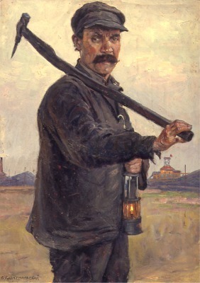
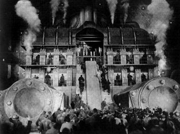
A few days ago, for example, I needed to reference a style of art for something I was working on. I could envision several images that I thought typified it. Art from the Soviet era. Larger than life portraits glorifying salt-of-the-earth peasants and stoic workers toiling toward a common good. Scenes from a silent movie: a huge factory wall, cogs and gears conveying the mechanistic, soulless nature of industrialization. But do you think I could remember the name of this evocative art style, or the famous movie in question?

Where to start? I headed for Wikipedia, and typed in art style glorifying russian revolution, and got zero results. Way too specific for Wikipedia (which is an encyclopedia). I headed to Google, and retried the search, changing my query to art style glorifying workers OR labour OR toil. Bingo! That was easy. The very first link was to a Wikipedia article about Socialist Realism. The article was comprehensive, with lots of images, including some great examples of this heavily stylized communist art form. I was part-way home, but still had found nothing about movies.

Back to Google. This time, I tried cinema workers OR toil OR factories OR industrialization. Nothing promising. Changed it to movies workers OR toil OR factories OR industrialization. Jackpot. The fourth hit down referenced Fritz Lang's famous silent movie, Metropolis (1927) the name that had eluded me.

Wikipedia again. This time, I typed in Metropolis. Nope. That's just about big cities. Then, I noticed a link labelled for other uses, see Metropolis (disambiguation). I clicked through to a list of other Wikipedia entries for this word. Part way down the page was a link to a detailed page of information about the film. Getting warmer. I had my movie, but was it socialist realism?

Turns out I had it totally wrong. On reviewing the Metropolis wiki entry, I learned that the film's focus on massive architecture, mood, and symbolism was a nod to German Expressionism. The Soviet-era Socialist Realism style of art and the brooding futuristic cinematic treatment in Metropolis are poles apart. And, once again, the Web set me straight.

Google Strategies for Finding the Unknown

The Google queries shown above worked because of the boolean OR operator. This operator allows you to instruct Google (or any search engine that supports boolean language) to return documents that match any one or more of the words typed. Without it, Google defaults to a logical "AND" condition, returning pages that contain all the words typed (likely too narrow a result in this case). Here's more on how to use this operator, along with some other strategies to try the next time you find yourself wondering what to search on.

  • Use Google, as I did here, for highly specific searches or for queries that contain lots of words. Start by brainstorming a list of words that describe the topic you are researching. Use boolean ORs to string together your list of words. ORs widen the search results and can be useful when you're not sure what you're looking for. Just type all the relevant words you can think of, separated by ORs. Be sure to type the word OR in upper case, with a space on either side.
  • Once you've identified your research concept (as in my socialist realism example), give Wikipedia a try rather than wading through Google results looking for definitive information sources. (Keep an eye out for Wikipedia entries in Google's results lists. They often appear at or near the top.)
  • In Google, save time with multiple sets of ORs in one query, such as cinema OR movies OR film workers OR toil OR factories OR industrialization. Think carefully about where you place the ORs. If there is no OR between two words, assume there is an implicit "AND," as between the words "film" and "workers" above. (Google does not recognize the AND operator because, in effect, there's already an AND there.)
  • As you start to refine your search, combine words and phrases as needed. The query "german expressionism" cinema OR movies OR film workers OR toil OR factories OR industrialization, for example, produces a highly targeted results set. Use double quotation marks to signify a phrase.
  • Don't hesitate to link multiple phrases with ORs, as in "socialist realism" OR "german expressionism" cinema OR movies OR film workers OR toil OR factories OR industrialization.
  • Bear in mind that Google has a 32 word limit.
  • Use parentheses, if you like, to group terms, as in ("socialist realism" OR "german expressionism") (cinema OR movies OR film) (workers OR toil OR factories OR industrialization). Google ignores them, but it can make it easier for you to understand.
  • Try Google's whole word wildcard. Another useful strategy when you don't know exactly what you're looking for, this special character — discussed here earlier — lets you try a "fill in the blank" approach.

That's it for now. Hope you found these musings useful. As for me, I'm heading over to eBay to pick up a copy of Metropolis.

Thursday, October 19, 2006

Blogger Categories Redux

Stumbled across yet another way to compensate for Blogger's annoying lack of categories functionality. This topic has been well covered here in the past, but in the interests of thoroughness, check out David Nicholson's Blogger categories hack. Me, I'm happy with my Labelr solution.

Friday, October 13, 2006

Major Victory for Canadian Freelance Writers

Yesterday was a pretty exciting day for freelance writers in Canada. The long-awaited Supreme Court decision in the landmark Heather Robertson vs. Thomson Corp. dispute finally came down — in writers' favour. It's been a long time coming. Canadian freelancers have been waiting ten years since Robertson first launched her $100 million class action lawsuit on behalf of an estimated 10,000 Canadian freelance writers against Thomson newspapers for copyright infringement.

Financed out of her own pocket, and helped by donations from writers, Robertson took Thomson to task over the unauthorized duplication of two articles she wrote for the Globe & Mail. These were reproduced in various online databases and CD-ROMs, along with the work of thousands of other writers (including yours truly), without her knowledge or consent.

The issue of electronic rights has been a contentious one that has profoundly impacted the livelihood of freelance writers. The heart of the conflict has been whether freelance material is covered by Canadian copyright as individual works, and thus owned by the writer or — as publishers claim — as part of a collective work owned by the publication.

Canadian writers have watched developments in the US (such as Tasini vs. the New York Times) with interest, waiting on tenterhooks as this case worked its way through seemingly infinite appeals. Debate in all of these battles has tended to center on whether online databases merely constitute a form of archiving, as publishers argue, or whether they represent a new distribution medium. These articles are re-sold on a subscription or pay-per-download basis, and creators argue that they should have the right to share in profits generated from subsequent uses of their work.

Yesterday, the Supreme Court announced its ruling, in a split decision in favour of writers (except on the CD-ROM issue, which they ruled was a different matter). For more information, see the PWAC web site.