Spread the Word

Site Feed


Powered by FeedBlitz

Subscribe with ...

  • Add this blog to my Technorati Favorites!
  • Subscribe in Bloglines
  • Subscribe in NewsGator Online
  • Subscribe in Rojo
  • Add Random 

Bytes (WebLens Blog) to Newsburst from CNET News.com
  • Add to Google
  • Add to My AOL
  • Subscribe in FeedLounge
  • Add to netvibes

Translate This Post

Burn a Feed

Ping the World

Showing posts with label Web Usability. Show all posts

Friday, July 21, 2006

Church Sites That Inspire

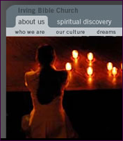
I'm not religious, but I love this web site! Stumbling around the Web late last night, I came across ChurchBeauty, and couldn't pull myself away. No, it's not about church architecture — though that would be interesting too — it's a showcase for quality church web sites, similar to the many CSS design galleries on the Web.

The site author (who, unfortunately, doesn't identify himself) has collected high-quality church sites and organized them into several categories, including clean, simple, colour scheme, photography, CSS, classic, video, and organic (not quite sure what that means). Though he focuses on visual design, he also provides categories for writing and usability. This is the first design gallery I have come across that acknowledges the importance of content.

He invites visitors to recommend sites for inclusion, and you can click through and rate the linked sites. A fun site to poke around, especially if you're seeking inspiration — divine or otherwise.

Friday, April 21, 2006

Dont Click It: Interface Breakthrough or Usability Nightmare?

I stumbled across an interesting experiment in user interface design a couple of days ago that may make you re-evaluate your relationship with your mouse. How hooked are you on clicking that button? Can you explore a web site without using your index finger? How easily can you navigate when deprived of a mouse click and a keyboard? How will you feel about the experience? Should you even care?

We are so accustomed to the point and click approach to navigation that clicking on something that interests us is second nature, almost instinctive. Or so believes the Institute for Interactive Research. They built an experimental Flash-driven site to learn more about how people interact with content, and whether there's a better way.

DontClickIt is a content-rich site that will challenge you to experience it fully. It provides background information about the rationale for the project and several user interface experiments you can participate in. It even lets you spy on others who have visited the site.

This is a site you will either love or hate. I imagine many people click away after only a few seconds. If you can stick it out and get the hang of it, there's some very interesting content there. So, what's your take? Visit DontClickIt and drop a comment back here. Web breakthrough or usability nightmare?