Spread the Word

Site Feed


Powered by FeedBlitz

Subscribe with ...

  • Add this blog to my Technorati Favorites!
  • Subscribe in Bloglines
  • Subscribe in NewsGator Online
  • Subscribe in Rojo
  • Add Random 

Bytes (WebLens Blog) to Newsburst from CNET News.com
  • Add to Google
  • Add to My AOL
  • Subscribe in FeedLounge
  • Add to netvibes

Translate This Post

Burn a Feed

Ping the World

Friday, December 29, 2006

Fractal Art: the Hidden Beauty in Numbers

My passion for making fractal art has deepened, to the extent that friends and family are beginning to worry about me. Virtually every evening, around 8:00 p.m. — after spending all day on the computer — I fire up a fractal program, and don't seem to be able to extricate myself til midnight, or later. (At least it's weaned me off the TV!)

I started out with Ultra Fractal, which I have blogged about here before. More recently, I began wading into the murky waters of a freeware program called Apophysis. The two programs are very different, as are the images they generate. You can often tell a UF image by the bold colours and almost psychedelic feel of the work. Images generated in Apophysis tend to be softer and more delicate, somehow — generally a little more subtle. The image at the top of this post was done with Ultra Fractal. The one to the left of this paragraph is an Apo fractal. Both programs are capable of creating mind-boggling works of art that explore unseen dimensions and seem to probe infinity itself.

I have recently been experimenting with Ultra Fractal's transformations — special effects you can apply to a fractal. One of these allows you to create a kaleidoscopic effect, as in the example at the right of this paragraph. Other transformations include the mirror ball and shimmering lake effects you see in the first image in this post.

Another recent discovery was a technique for outputting fractals as transparent PNGs. Removing the default black background opens up all kinds of creative possibilities. You can place the fractal on a background image, for example, as David Annal does at his site, ApophyStash. I use this method so I can create multiple versions of a fractal, with different background colours. To do this, just output your Apo fractal as a PNG. Then open it in PhotoShop. Add a new layer and drag it down below the fractal layer. Then choose a colour and fill the new layer with the paint bucket or gradient tool. The fractal will appear to float over the background.

Creating fractal art is definitely a trial and error process, and incredibly time-consuming. I don't want to use the word "addictive," but I'm beginning to feel like I'm in the throes of a very strong compulsion.

Where to Download Software

There are many fractal programs. Here are a few of the most popular:
If you try these out, let me know which you prefer and why. And welcome to the abyss!

Wednesday, November 29, 2006

Photo Duck Funnies Right On

Saw a link yesterday in the Shutterstock discussion forums to a clever online comic strip about the trials and tribulations of daring to earn a living as a photographer. What the Duck is shutterbug Aaron Johnson's wry take on all things photographic. Johnson lets his readers name each strip through his blog's comments feature, and just reading the comments on some of the strips can be pretty entertaining. Check it out. Some of the strips are hilarious.

Friday, November 24, 2006

Transparent PNG Generator

A while back, I blogged about CSS transparency techniques, describing two methods for incorporating transparent elements into your design. You can also introduce transparency by using PNG format images. Unlike GIF images, which are either "on" or "off" in terms of opacity, PNG images support full alpha transparency. This means each pixel can display a subtle range of tones from 0 to 255.

There are many ways to create transparent PNG images. If all you need is a plain transparent block to use as a background, check out Stian Grytøyr's handy transparent PNG generator. This useful tool allows you to select a colour by clicking on a color wheel. The tool creates a set of samples ranging from 0% to 100% transparency, in three versions of the selected colour (web-safe, "web-smart," and unsafe).

Lighten or darken the sample by clicking on the saturation/lightness patch to the right of the colour wheel. When you have the desired shade, click through on one of the percentage samples to see it used with some demo text against a busy background. From here, you can adjust the image dimensions, transparency, and colour. Right-click on the final rendered sample to save the image to your hard drive.

Note: The PNG graphical format enjoys strong support among compliant browsers such as Firefox, Opera, Safari and IE version 7. If, however, you view Grytøyr's page in IE 6 or lower, you will not see the transparency effect, as earlier versions of IE do not support full alpha transparency. For details, and a workaround, see A List Apart's article, Cross-Browser Variable Opacity with PNG: A Real Solution.

Monday, November 13, 2006

Output Your Designs on Merchandise

I mentioned a while ago that I was trying out some microstock photography sites as a sales venue for my fractal art images. I have been looking for novel ways to give these images as gifts, especially with the holiday season coming up. My Canon i9900 colour inkjet printer does a surprisingly good job of printing my fractals for use as greeting cards or as framed prints, but I've been looking for something a little more out of the ordinary. A couple weeks ago, I found the solution.

CafePress.com allows you to upload your own designs for output on a wide variety of merchandise. From sheatshirts, caps, and t-shirts to mugs, mousepads, buttons, and more, there is no upfront cost to customize an item whether for your own use, as a gift, or to sell. This solution is ideal for artists, designers, or photographers who want to showcase their work or supplement their income. And it's a useful low-cost alternative for small organizations that don't have huge budgets for logowear.

The site allows you to set up a free online store and set your own pricing over a baseline figure that they establish. They print your designs on demand and handle order fulfillment, payment processing, shipping, and customer service. The free shop service does place limitations on the number of products you can customize (basically one of each item), but for only $6.95 per month (less for longer terms), you can upgrade to their premium shop option, which imposes no such limitations. I'm trying out the premium shop service for three months, with a store that I have called Fractalicious. If you like any of my designs, I'd be grateful for your support.

Even if you don't have a creative bone in your body, you may still want to check out some of the other shops at CafePress. From politics to the environment, from pets to popular culture, you're likely to find something among their extenstive inventory for even the most hard to please person on your list.

Wednesday, November 08, 2006

Disabling the Blogger Navbar

Here's a great tip from reader Matt Mc. Matt commented in response to a post about customizing your Blogger template that he finds Blogger's default navbar annoying. Blogger doesn't let you disable this feature but Matt shared a short snipped of CSS that you can add to your template to suppress it.

I tested it out and it works great, though I have re-enabled it on this blog, as I don't mind the navbar and its search feature could be useful to you. (For readers new to blogging, the navbar is the black horizontal bar at the top of this blog, just above the header graphic. It offers some useful functionality and is intended, in theory at least, to deliver traffic to your blog from other Blogspot blogs.)

Turning Off the Navbar

Here's how to disable the Blogger navbar:
  1. Open your template and locate the style section at the top, just under the <$BlogMetaData$> tag.
  2. Find a space between two other styles, and type the following code:
    #b-navbar {
    height:0px;
    visibility:hidden;
    display:none
    }
  3. Save your changes and view your blog. The navbar should be gone.

Once again, the elegant simplicity of CSS saves the day. Technically, this combination of style declarations doesn't really turn off the navbar; it just hides it from view.

Note: there is some question as to whether disabling the navbar violates Blogger's terms of service, though I could find nothing specific on their site relating to this.

Thursday, November 02, 2006

Taking Your Password to the Grave

My daughter works in IT security, and every now and then she forwards me an interesting link on some security-related topic. Most go right over my head — they abound in techspeak or are outside my realm of interest or expertise. A recent article she sent me, though, certainly got my attention. In Taking Passwords to the Grave, News.com's staff writer Elinor Mills probes the implications of failing to ensure that your loved ones have access to online passwords and other important digital identifying information.

When people fail to leave such information behind, family members are increasingly unable to access important data and, in some cases, to attend to estate business. Even notifying a loved one's email contacts can become problematic, since e-mail providers and other companies may be reluctant to give out such information, for privacy reasons. Mills recommends avoiding this problem by ensuring that passwords to e-mail, photo sharing, music sites and other online accounts are recorded safely somewhere, preferably in an estate planning document.

She cites the case of William Talcott, a prominent Irish/American poet, whose estate was paralyzed after he died because his daughter could not access his email account or online address book.

I had certainly never thought about this! Like many people, I derive income from the Web and do my banking and investing online. I have numerous passwords stored in my head (scary thought!), along with multiple email logins. Ditto with access to all the various sites where I shop, download software, upload images for sale, register web domains, post blog entries, and on and on. There are dozens of them, and I have not recorded this information anywhere. If I passed away tomorrow, my daughter would have her hands full sorting out my online life. She'd have to close accounts, cancel domains, cash in accrued revenue, pay outstanding fees, and on and on. Then there are decisions about intellectual property, such as all the photos and fractals I have uploaded to Flickr and elsewhere. Just thinking about it makes me tired.

This sobering article is worth a look, calling attention to a little loose end that many of us hadn't thought about.

Tuesday, October 24, 2006

Searching When You Don't Know What You're Looking For

Searching the Net is not unlike detective work. More often than not, I find myself following a convoluted trail of clues, with success often requiring not so much ingenuity as sheer dogged determination.

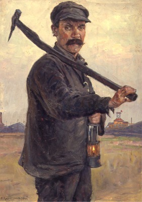
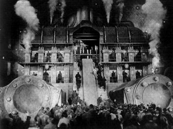
A few days ago, for example, I needed to reference a style of art for something I was working on. I could envision several images that I thought typified it. Art from the Soviet era. Larger than life portraits glorifying salt-of-the-earth peasants and stoic workers toiling toward a common good. Scenes from a silent movie: a huge factory wall, cogs and gears conveying the mechanistic, soulless nature of industrialization. But do you think I could remember the name of this evocative art style, or the famous movie in question?

Where to start? I headed for Wikipedia, and typed in art style glorifying russian revolution, and got zero results. Way too specific for Wikipedia (which is an encyclopedia). I headed to Google, and retried the search, changing my query to art style glorifying workers OR labour OR toil. Bingo! That was easy. The very first link was to a Wikipedia article about Socialist Realism. The article was comprehensive, with lots of images, including some great examples of this heavily stylized communist art form. I was part-way home, but still had found nothing about movies.

Back to Google. This time, I tried cinema workers OR toil OR factories OR industrialization. Nothing promising. Changed it to movies workers OR toil OR factories OR industrialization. Jackpot. The fourth hit down referenced Fritz Lang's famous silent movie, Metropolis (1927) the name that had eluded me.

Wikipedia again. This time, I typed in Metropolis. Nope. That's just about big cities. Then, I noticed a link labelled for other uses, see Metropolis (disambiguation). I clicked through to a list of other Wikipedia entries for this word. Part way down the page was a link to a detailed page of information about the film. Getting warmer. I had my movie, but was it socialist realism?

Turns out I had it totally wrong. On reviewing the Metropolis wiki entry, I learned that the film's focus on massive architecture, mood, and symbolism was a nod to German Expressionism. The Soviet-era Socialist Realism style of art and the brooding futuristic cinematic treatment in Metropolis are poles apart. And, once again, the Web set me straight.

Google Strategies for Finding the Unknown

The Google queries shown above worked because of the boolean OR operator. This operator allows you to instruct Google (or any search engine that supports boolean language) to return documents that match any one or more of the words typed. Without it, Google defaults to a logical "AND" condition, returning pages that contain all the words typed (likely too narrow a result in this case). Here's more on how to use this operator, along with some other strategies to try the next time you find yourself wondering what to search on.

  • Use Google, as I did here, for highly specific searches or for queries that contain lots of words. Start by brainstorming a list of words that describe the topic you are researching. Use boolean ORs to string together your list of words. ORs widen the search results and can be useful when you're not sure what you're looking for. Just type all the relevant words you can think of, separated by ORs. Be sure to type the word OR in upper case, with a space on either side.
  • Once you've identified your research concept (as in my socialist realism example), give Wikipedia a try rather than wading through Google results looking for definitive information sources. (Keep an eye out for Wikipedia entries in Google's results lists. They often appear at or near the top.)
  • In Google, save time with multiple sets of ORs in one query, such as cinema OR movies OR film workers OR toil OR factories OR industrialization. Think carefully about where you place the ORs. If there is no OR between two words, assume there is an implicit "AND," as between the words "film" and "workers" above. (Google does not recognize the AND operator because, in effect, there's already an AND there.)
  • As you start to refine your search, combine words and phrases as needed. The query "german expressionism" cinema OR movies OR film workers OR toil OR factories OR industrialization, for example, produces a highly targeted results set. Use double quotation marks to signify a phrase.
  • Don't hesitate to link multiple phrases with ORs, as in "socialist realism" OR "german expressionism" cinema OR movies OR film workers OR toil OR factories OR industrialization.
  • Bear in mind that Google has a 32 word limit.
  • Use parentheses, if you like, to group terms, as in ("socialist realism" OR "german expressionism") (cinema OR movies OR film) (workers OR toil OR factories OR industrialization). Google ignores them, but it can make it easier for you to understand.
  • Try Google's whole word wildcard. Another useful strategy when you don't know exactly what you're looking for, this special character — discussed here earlier — lets you try a "fill in the blank" approach.

That's it for now. Hope you found these musings useful. As for me, I'm heading over to eBay to pick up a copy of Metropolis.

Thursday, October 19, 2006

Blogger Categories Redux

Stumbled across yet another way to compensate for Blogger's annoying lack of categories functionality. This topic has been well covered here in the past, but in the interests of thoroughness, check out David Nicholson's Blogger categories hack. Me, I'm happy with my Labelr solution.

Friday, October 13, 2006

Major Victory for Canadian Freelance Writers

Yesterday was a pretty exciting day for freelance writers in Canada. The long-awaited Supreme Court decision in the landmark Heather Robertson vs. Thomson Corp. dispute finally came down — in writers' favour. It's been a long time coming. Canadian freelancers have been waiting ten years since Robertson first launched her $100 million class action lawsuit on behalf of an estimated 10,000 Canadian freelance writers against Thomson newspapers for copyright infringement.

Financed out of her own pocket, and helped by donations from writers, Robertson took Thomson to task over the unauthorized duplication of two articles she wrote for the Globe & Mail. These were reproduced in various online databases and CD-ROMs, along with the work of thousands of other writers (including yours truly), without her knowledge or consent.

The issue of electronic rights has been a contentious one that has profoundly impacted the livelihood of freelance writers. The heart of the conflict has been whether freelance material is covered by Canadian copyright as individual works, and thus owned by the writer or — as publishers claim — as part of a collective work owned by the publication.

Canadian writers have watched developments in the US (such as Tasini vs. the New York Times) with interest, waiting on tenterhooks as this case worked its way through seemingly infinite appeals. Debate in all of these battles has tended to center on whether online databases merely constitute a form of archiving, as publishers argue, or whether they represent a new distribution medium. These articles are re-sold on a subscription or pay-per-download basis, and creators argue that they should have the right to share in profits generated from subsequent uses of their work.

Yesterday, the Supreme Court announced its ruling, in a split decision in favour of writers (except on the CD-ROM issue, which they ruled was a different matter). For more information, see the PWAC web site.

Wednesday, October 04, 2006

Microstocks Shake Up the Stock Photography Market

Royalty Free Images For some time now, I have been selling photos and artwork online through a new brand of stock photography site that is shaking up this highly traditional marketplace.

At sites like Corbis and Getty — which have long dominated the industry — professional photographers sell their work for payments ranging into the hundreds of dollars per image.
Now, an emerging army of micropayment stock photography sites is creating serious competition for the traditionals. Still a relatively new phenomenon, the microstocks allow people to buy images on a subscription or pay per download basis, for as little as 25¢ each. You make up the difference on volume, at least in theory.

There are dozens of microstocks, with new players emerging every day. I have been experimenting with some of them for several months now. Here's what I've found:

  • DreamsTime: Sales are sluggish, though this site pays the best of the few I have played with, at up to $10 per image. Purchase available on a subscription or pay per download basis. Slow approval response time (5-10 days). Moderate rejection rate (18%), for sometimes arbitrary reasons. They have rejected two images that are best sellers on other sites.
  • Shutterstock: This site is my favourite, hands-down, even though they only pay 25 cents per download. Due to the volume of downloads, however, I have earned almost ten times the income generated by the other micros I use. For some reason I cannot fathom, my images sell like hotcakes here. SS turns around approvals speedily and, so far, I have enjoyed a 100% acceptance rate! The one time they rejected an image, it was accepted after I fixed the problem and resubmitted. Shutterstock works on a subscription basis only, which may be the key to their success.
  • Fotolia: A new player, originating in France, this site caters to Europe and North America. Pricing ranges from $1 to $3. Approvals are fairly quick and rejections minimal (5%) though, like DreamsTime, they sometimes reject images for seemingly arbitrary reasons. Sales through this site, which are on a pay per download basis, have been slow.
  • iStockPhoto: The grand-daddy of them all, this site is also the most picky and demanding in my experience. In fact, I gave up shortly after submitting my first batch of images. iStock rejected every single image, either as not suitable for their audience or due to defects that the other micros didn't see. iStock pricing ranges from $1 to $5, on a per download basis.
  • 123RoyaltyFree: 100% acceptance rate, but abyssmal response time and only one sale so far. It takes weeks for uploaded images to be reviewed and OK'd at this site. I have stopped uploading, but maybe it will work for you. 123RF is well spoken of in some of the microstock discussion groups. Pricing works on a subscription or pay per download basis, the latter at $1.20 per image.

Though many professional photographers deplore the microstocks, debate in some of the online microstock discussion groups tends to suggest that some pros are experimenting with this new marketplace. More than a few people predict that the new market economics — why pay hundreds of dollars when you can get just as good an image for $1.00? — will spell the end of the traditionals. I wouldn't be surprised to see the big players launch their own microstock brands within the year.

For me personally, the microstocks have not been a fast track to wealth and fame, but they have generated a nice little income supplement. Be warned, though: you need a fairly high volume of images accepted to see any real return. Keywording is tedious, but vitally important. Get a good FTP utility, and save time by storing descriptions and keywords within images (look for tools that support EXIF/IPTC data retrieval); these fields will then populate automatically when you upload.

For a good introduction to microstock photography sites, see Stephen Finn's excellent guide. For more microstock and traditional stock photography resources, see the WebLens image search page.

Wednesday, September 27, 2006

100 Posts and Counting

With publication of the previous article, Random Bytes reached the 100 post milestone — a feat that seemed inconceivable when I started this blog. It's hard to believe I've had that much to say. When I started blogging, I worried about finding things to write about. Today, the primary challenge lies in managing my favourites, which are bulging with links to sites and topics I hope to cover in this space. That, and finding time to post. Oh well. Onwards and upwards :-)

Wednesday, September 20, 2006

Blog Stolen Again!

Well, I guess imitiation is supposed to be the sincerest form of flattery. But I must confess that, this time, the main emotion I felt on seeing yet another unauthorized copy of this blog floating around the Internet was extreme irritation. At least, now I knew how to proceed.

A few months back, I posted about the shock of learning someone had cloned my blog, and the subsquent struggle to get the illicit copy taken down. This time around, I knew exactly what to do. The offending copy appeared at http://www.pkblogs.com/weblensblogs and at http://www.inblogs.net/weblensblogs. A quick WHOIS check revealed that these sites are hosted by DreamHost.com.

I fired off an email to DreamHost's abuse reporting address, citing the infraction and the name and contact information of the offender (all of which is usually available through a WHOIS query).

A big thumbs-up to DreamHost! Unlike Blogger, they were fast to respond and very co-operative, advising me that — once again — I needed to file a formal complaint under the Digital Millennium Copyright Act. But before I even got that far, I heard back from DreamHost: they had contacted their customer to warn that a complaint was coming. That was all it took. The offending copies were gone in less than 24 hours.

Thursday, September 14, 2006

25 Worst Tech Products of All Time

Just sent to me this morning by my daughter, this link is worth sharing here. InterGovWorld's recent article, The 25 Worst Tech Products of All Time, makes for an interesting read, and will no doubt bring back some cringe-inducing memories for those of you who have been around high-tech for a while. The short-lived IBM PCJr. Iomega zip drives. Real Player. AOL (remember all those "free" CDs?) A wearable DVD player (I kid you not). PointCast's push technology (replaced, interestingly enough, by today's Web 2.0 RSS feed technology). And so much more.

Check it out.

Monday, September 11, 2006

Horizontal Suckerfish and More CSS Menu Resources

I blogged back in June about my efforts to enhance WebLens with CSS-based dropdown menus that were standards compliant and which work across all browsers, including the persnickety Internet Explorer. In a post on creating dropdowns that work in IE, I summarized the three approaches I had found. I chose the very popular Suckerfish solution for WebLens, and it has been a great success.

In building the menu system recently for a site about a popular Canadian television personality, I wanted to modify the Suckerfish code to display the sub-menus horizontally in a row instead of stacked one below another as seen on WebLens. Google queries on this didn't lead to much, except a few help requests posted to webmaster forums, so I puzzled it out myself.

You can see the result of this tweak at the site mentioned above, and the code is available here for your use, should you want to play with it. I'm pretty happy with it; the only failing has been my inability to figure out how to align the sub-menus with the left edge of the top menu containing DIV, instead of the individual list items. No amount of fiddling around with positioning seemed to solve this.

In trying to troubleshoot this challenge, I never did find a fix, but I came across more helpful CSS menu resources, including some great articles:

Had I seen the ListApart Hybrid CSS Dropdowns article earlier, I might have chosen that technique instead of struggling to modify the Suckerfish code myself. Oh well. Live and learn :-)

I can't wrap this up without mention of a couple of CSS and/or DHTML menu generators (free and/or for fee) for those not inclined to hand code. Check these out:

Hope you find these resources useful. Enjoy!

Friday, September 08, 2006

Making Old Blog Posts Findable

One of the challenges of creating a blog that's useful to readers is the default date order of content. Unlike a traditional web site, which is structured thematically by subject, blog articles are posted in chronological order. Once they pass off the index page, posts are grouped in monthly archives where they are also listed chronologically. This presents a big challenge in getting older posts found, especially in Blogger which (unlike Wordpress and some others) doesn't offer a way to categorize posts.

There are, of course, blog search tools like Technorati and others, but I find that the vast majority of my blog traffic still comes from Google, which you might reasonably expect to ferret out old posts based on the user's keyword choices. Unfortunately, however, Google doesn't seem to crawl blogs as deeply as it does traditional web sites (perhaps because of the date structure combined with the abundance of outgoing links on many blog index pages).

I have found that Google indexes posts in a hit or miss fashion. When users search on a topic that has expired, if Google has not captured that specific post, it is likely to direct people to your index page, where the article lived at the time that Google crawled the page.

Determined and/or lucky users may find the post in Google's cache, on an archive page, or through a link from another post. My stats have shown, however, that the majority of people landed on my index page, gave it a quick scan, and headed promptly for greener pastures, never finding what they were searching for.

Fortunately, there is a simple solution: after publishing each new post, take a second to submit the post's permalink directly to Google's Add URL page. I have been doing this for months now, and have seen a massive change in my stats. Fewer users are landing on the index page; the vast majority of people are going directly to the relevant post. Random Bytes is getting read, and people are finding what they need. (Note: for this to work, you need to ensure that you have enabled individual post pages in your blogging software's dashboard.)

Just in case you're wondering, while Google's Add URL page discourages this practice, nowhere does it state that submitting multiple pages from the same site is a policy violation.

And of course, remember that links from other blogs and web sites are still among the most important ways to get found and indexed by Google.

Hope this helps.

Tuesday, September 05, 2006

Intensifying Images With Photoshop Vivid Fog Effect

Hi folks. Sorry for the lapse in postings. I actually managed to get a break from the computer to enjoy some sunshine in these waning days of summer. Back full force now, though, with a great tip from James, a friend and fellow Photoshop junkie. Vivid fog is an easy three-step effect (which you can turn into a Photoshop action) that adds drama to ordinary images, and can also be used to create striking silhouettes of foreground objects.

To use this effect:

  1. Start with a quality image with good foreground/background delineation and subtle colour. Low light levels and the presence of an obvious foreground object or figure add more drama.
  2. Open the image in Photoshop and copy the background to new layer.
  3. Bump up the saturation of the new layer (to the maximum for the most drama).
  4. Apply a Gaussian blur to the new layer (10 pixels seems to work well, for 300 dpi images).
  5. Change the new layer's blend mode to Soft Light.
  6. Save your work in the appropriate file format.

Viola! James suggests you make these changes right on the background copy rather than applying adjustment layers. He also uses an "S" curve to heighten contrast, or a Levels adjustment to increase colour, such as the red in a sunset. He suggests making these adjustments before the saturation and blur steps.

You can see before and after examples at the top of this article. As you can see, the colour in the original image was quite subtle before applying the vivid fog effect. At right is a third version, with the foreground masked to reduce the sense of underexposure created by this process.

Hope you find some interesting uses for this. Enjoy!

Monday, August 21, 2006

Blogger Hacks: Uploading Template Backgrounds

In my previous post, I stated that, if you wish to use images in your template's background, you'll need to host them elsewhere since there's no way to upload them directly to Blogger for this purpose. Reader Paul Sutherland quickly set me straight, outlining a clever trick I'd never thought of but which — on reflection — is at obvious as the nose on your face.

As we all know, Blogger allows you to upload images for use in individual posts. Paul's hack takes advantage of this ability. Here's how it's done:

  1. Create a new post as usual.
  2. Upload an image to your new post (click the Add Image button).
  3. While still in post edit mode, switch to HTML view (click the Edit HTML tab).
  4. Find the code for your image.
  5. Copy the image address (it starts with http://).
  6. Return to the main Post screen and discard the temporary post.
  7. Open your template and paste the image address into the appropriate spot, as per the instructions in the previous post.
  8. Save your template and publish.

Thanks Paul! Great tip.

Tuesday, August 15, 2006

Template Background Hacks and Generator Tools

Random Bytes has had a facelift. For those who have been here before, the new look may be a bit of a surprise. If you popped by yesterday afternoon, my apologies. This blog's look and feel was evolving minute by minute, as I experimented with colours and backgrounds.

I think I've got something I like now, though, so it shouldn't change too much more. I felt it was time for a fresh look, especially since the old look and feel has been propagated through the blogosphere with the growing popularity of my three-column template.

For the new design, I wanted to focus on simplicity and readability. The first priority was eliminating the background mouse graphic, which had cluttered up the design and drawn some negative feedback for slowing page loads.

Creating Background Colours and Patterns

In choosing a color palette, I opted for a monochrome colour scheme, staying with green to tie into WebLens (albeit subtlly). I wanted the blog contents to display against a background colour or pattern, and found Rails2U's Background Image Maker indispensable. This useful tool allows you to generate any size background rectangles for tiling. You can specify desired color by dragging sliders or entering a hex code. The tool allows you to choose between stripes, dots, and gradients, and supports full PNG transparency.

There are also plenty of free online sources of background rectangles for tiling, such as the collection at GRSites. (If you use these, be careful of placing text directly against a busy background. Place a white or coloured background behind the text first, as I have done here.)

Adding Backgrounds to Your Blog

You can use the images produced by the tools mentioned above as your blog's main background as I have done here, or place them behind various CSS elements, as you seen in the sidebars and post titles of this blog. For this re-design, I finally settled on a striped green background for the main page and a subtle green gradient to use for emphasis and visual interest.

To add a background pattern to your blog

  1. Open your template and locate the CSS for the body tag.
  2. Between the opening { and closing } parentheses, add a background declaration pointing to where the background image is hosted, as in
    background: url("http://your-domain-and-filename.png") repeat;
    (Note that you will need to host these images elsewhere, as you can't upload them to Blogger.)

The repeat attribute controls tiling, telling Blogger to replicate the graphic both horizontally and vertically, as I have done in the main background here. To repeat only horizontally, as in this blog's post headings, change the repeat attribute to repeat-x. (For vertical repeats, it would be repeat-y.)

To add background tiles to post headings

  1. Open your template and locate your blog's CSS post declaration.
  2. Add the above code, but with repeat-x. Note: you may need to move the opening post div tag above the date header, to get the background behind everything. Depends on the effect you want.

To add background tiles to sidebar elements

In this blog, I could have placed a background gradient or texture behind the entire sidebar, but I wanted to use them to emphasize certain sidebar contents. To do this:

  1. Create a style specifying the desired formatting, such as
    .BlueGradient { background:url("http://your-
    domain-and-filename.png
    ") repeat-x; padding-top:2px;}
  2. In the HTML, locate each set of sidebar elements you wish to emphasize, and enclose each within your new div, as in this example:
    <div class="BlueGradient ">
    <h2>Archives</h2>
    <ul class="archive-list">
    <BloggerArchives>
    <li>
    <a href="<$BlogArchiveURL$>">
    <$BlogArchiveName$>
    </a></li>
    <BloggerArchives>
    </ul>

    </div>
  3. Save your changes and view your blog. You may need to adjust margins or padding to get the effect you desire.

For more on adding backgrounds to your blog, see this earlier post. Hope this information helps, and let me know what you think of the new design.

Tuesday, August 08, 2006

The Web's Most Useful Site?

I may have just stumbled across the Internet's most useful site — for webmasters at least. The Scrutinizer is a single page from which you can run dozens of different tests on the content of any page in your site. Available tests run the gamut from HTML and CSS validation and link popularity and rank checks to pings and traceroutes, plagiarism checks, site speed tests, and more.

Just enter your URL, select the test(s) you want, and click Go. Great resource.

Thursday, August 03, 2006

Tips for Photoshop Memory Management

I feel like I've won the lottery! My laptop computer is the happy recipient of 1.5 GB of additional memory, bringing the total RAM available from 512 MB to 2 GB. I resorted to this move (reluctantly, and at considerable expense) after tiring of sluggish performance, overheating, and frequent crashing when using Photoshop and other memory-intensive applications. The hard drive churned like a demon constantly as Photoshop paged out what it couldn't handle in memory to the swap file. It was even worse with fractals. The screen refresh rate was slow and it took many hours to render complex images to disk because of limited memory.

The additional RAM has turned my humble little laptop into a powerhouse, virtually solving all my Photoshop performance issues overnight. If you are experiencing similar problems and you don't have the luxury of adding 2 GB of RAM, there are some things you can do to boost Photoshop's memory handling. For a good discussion of this topic, see the MacWorld article, Optimizing Photoshop CS2.

The tips provided in this article improved the situation considerably in the lengthy interim before I finally bit the bullet and sprang for more RAM. Among the things I learned was that I had been allocating too much memory to Photoshop. This caused long delays — and even crashing — when saving, as Windows and CS2 duked it out for the tiny amount of available RAM.